
It is like a dream for almost every packaging brand to have its product packaging show off crisp, vivid printing. Sometimes, the image that looks great on screen does not appear nicely when printed on packaging boxes. Well, this is why you should know about the DPI. It is one of those things you really need to get right. By picking the correct DPI, you can prevent all that.
So let us break down what DPI actually is, when to use it, and how it affects the final look of your printed packaging.
What Is DPI?
DPI is abbreviated for Dots Per Inch, and it measures how many tiny ink droplets a printer lays down in one inch. When the DPI is higher, those dots sit closer together—meaning your printed image gets more detail, more clarity, and a more polished look.
Talking about custom packaging, 300 DPI is considered the sweet spot. It gives sharp results without oversizing the file.
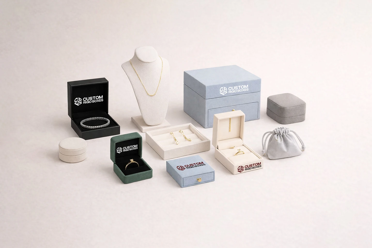
But some projects, especially those that require fine detail such as premium quality custom rigid boxes, may benefit from increasing to 600 DPI.
When Should You Use DPI?
Although in product packaging, 300 DPI is the usual standard, the “right” DPI, either lower or higher, really depends on what you are printing.
When 300 DPI is the right choice
- For standard product labelling, it provides a great balance between sharp images and manageable file size.
- For closed-up viewing, it controls irregular edges or fuzzy text when customers examine the packaging.
- For pleasing brand visuals, such as logos and important graphics. It maintains a professional, high-quality appearance.
When a lower DPI works
- For shipping and warehouse labels, like barcodes or simple text, about 203 DPI is enough. It works great when no detailed design is required to print.
- For large-scale printing, such as flexes, banners, or billboards, where bigger designs are to be viewed from far away. In short designs that do not need super fine detail.
When you should go higher (like 600 DPI)
- Premium or highly detailed packaging: Tiny text or intricate artwork prints cleaner at higher DPI.
- Small labels: When you need extra clarity while working in tight spaces, and more text to fit in.
DPI vs PPI — What Is the Difference?
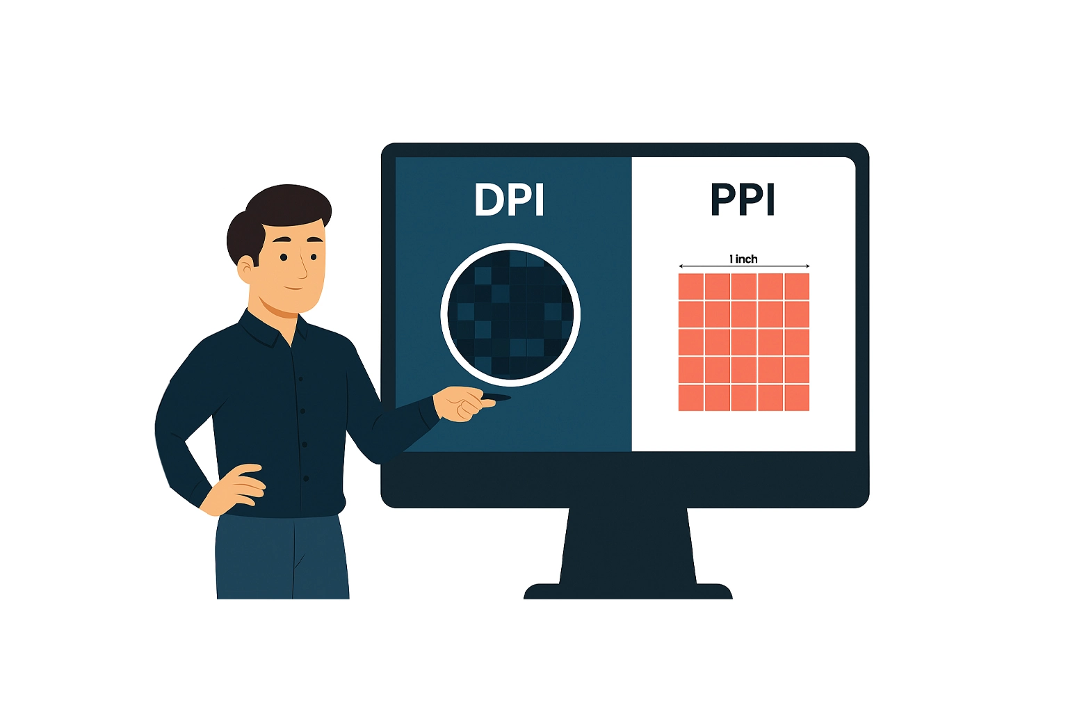
The other term you will also see in packaging design is PPI, which stands for Pixels Per Inch. This is all about how an image appears on your screen, not in print.
To put simply, higher PPI means smaller pixels and a crisper digital image. When the pixels are tiny and packed tightly together, your eyes can not distinguish them individually, so the image looks smoother and more detailed.
What Is PPI?
PPI tells the pixel density of digital images. A higher number gives you cleaner, sharper visuals on monitors or mobile screens. Lower PPI means bigger pixels and less clarity.
When to Use Different PPI Settings
- 300 PPI: It is best for preparing images that will be printed with high quality, such as packaging boxes, books, or magazines.
- 150–200 PPI: This works well for large prints that people would not see up close, such as billboards.
- 72 PPI: It is best suited only for web or digital use—definitely not for packaging.
The Key Difference
- PPI = digital image quality (RGB color model).
- DPI = printed image quality (CMYK color model)
A design can look flawless on your screen thanks to high PPI, but if it does not have the right DPI when printed, it will look completely different.
Here is a quick comparison:
| Key Attributes | PPI | DPI |
| What does it Means? | Pixels per inch on screen | Ink dots per printed inch |
| What Is its Main Focus? | Digital image resolution | Print resolution |
| Which Color Model does it use? | RGB | CMYK |
| What Are the Outcomes? | Crisp digital views | Clean, consistent printed images |
Key Factors to Consider When Choosing DPI
While 300 DPI usually works for most packaging designs, like chocolate boxes, or any design that needs sharp, eye-catching visuals there are a few things you should consider:
- File size management: Extremely high resolutions can slow down processing without adding noticeable improvement.
- Human perception: Around 300 DPI matches what the average eye can comfortably see.
- Industry standards: 300 DPI is widely accepted and expected in professional printing.
- Avoiding pixelation: Anything under 300 DPI can look fuzzy when printed.
Why DPI Matters in Custom Packaging?
No matter what you are creating customized rigid boxes, folding cartons, detailed labels—DPI helps ensure everything from your logo to product photos prints beautifully.
Here is why it is so important:
A standard 300 DPI produces vibrant, high-quality output by keeping text and images sharp rather than grainy. It also strikes a balance between clarity and efficiency, giving you crisp visuals without creating oversized files that slow down production.
On top of that, DPI ensures reliable results across different materials—whether you are printing a small sticker or an entire box, your designs stay consistently clean and professional.
Some Helpful Practical Tips For Better Outcomes
Even with the correct DPI, you can still run into printing surprises. These tips help keep things on track:
1. Choose the Right Paper and Ink
Your design is only part of the equation. Paper type, ink quality, and the printer itself all influence the outcome. In CMYK printing, your four ink colors blend into thousands of shades—so clean overlap and good materials matter.
2. Think About Viewing Distance
If customers will be holding your packaging up close, stick with higher DPI settings for sharper detail.
3. Consider the Size of Your Print
Smaller designs can look crisp at 150–300 DPI. Larger surfaces may benefit from higher resolution to maintain clarity across the whole piece.
Final Thoughts
If your packaging ever looked totally different in print than it did on your screen, DPI was likely the culprit. Higher DPI means tighter ink placement, clearer detail, and better overall quality. That is why 300 DPI remains the gold standard for most packaging—it delivers sharp visuals, manageable file sizes, and consistent results.
Hopefully this breakdown gives you a solid grasp of how DPI works and how to choose the best settings for your custom packaging. If you get the DPI right from the start, your packaging will look exactly the way you imagined it—crisp, colourful, and completely professional.
FAQs For DPI in Packaging
Q1. What does DPI mean in packaging?
DPI stands for Dots Per Inch. In terms of printing, it is measured by the number of small ink dots a printer puts down in one inch of printed space.
Q2. What DPI should I use for custom packaging?
300 DPI is the standard for custom packaging. But if you have detailed artwork to print or luxury packaging, you should go for 600 DPI.
Q3. Can I use a lower DPI for some packaging prints?
Totally. You can use a lower DPI for shipping labels, barcodes, and simple text, usually around 203 DPI.
Q4. What is the difference between DPI and PPI?
PPI is what you see on your screen, and DPI is what you get when it is printed. High PPI makes your digital image look clean, but without the right DPI, it would not print that way.